Restaurant KPI Dashboard Template
Track food cost percentage, labor percentage, prime cost, table turnover, and the other KPIs that determine whether your restaurant is actually profitable.
What's Inside This Restaurant KPI Dashboard Template
This template includes 5 worksheets, each designed for a specific part of your restaurant financial workflow:
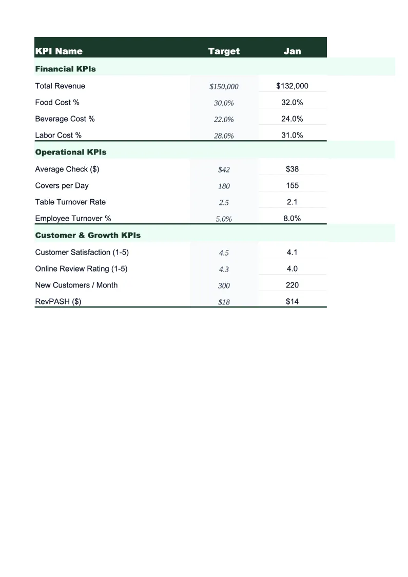
KPI Dashboard
The main visual overview showing your restaurant's critical performance metrics at a glance.
Daily Operations
A structured daily log for entering covers, revenue, food costs, and labor hours by shift.
Monthly Scorecard
Set your targets for each KPI at the start of the month, then enter actuals as you go.
12-Month Trends
A rolling 12-month view of your most important KPIs plotted as line charts.
Prime Cost Calculator
A dedicated worksheet for calculating prime cost — the sum of food, beverage, and labor costs as a percentage of total sales — which is the single most reliable indicator of restaurant profitability.
Restaurant KPI Dashboard Features
- 22 pre-loaded restaurant KPIs including food cost %, prime cost, and RevPASH
- Color-coded status indicators — green/yellow/red against your set targets
- Daily operations log with per-shift revenue and cost tracking
- Prime cost calculator with quick-service and full-service benchmarks
- 12-month trend charts for food cost, labor, and average check
- FOH and BOH labor tracked separately with individual cost-per-cover formulas
How to Use This Restaurant KPI Spreadsheet
Start with the Monthly Scorecard tab and enter your targets for the month. If you don't have formal targets yet, use the benchmark ranges in the template as starting points — the food cost cells, for example, are pre-populated with the 28–35% industry range so you have something to compare against from day one. Updating targets takes about 10 minutes, and you only need to do it once per period.
Enter your daily numbers in the Daily Operations sheet as you close each night — it takes about two minutes once you have your POS report open. Revenue, cover counts, and labor hours go in by shift; food cost entries can be done daily or weekly depending on how often you do inventory counts. The formulas calculate your food cost percentage and labor cost per cover automatically and feed into the monthly scorecard.
15 minutes from download to your first KPI review
Download the template, enter your targets, and start tracking the metrics that actually determine whether your restaurant is profitable.
Why Every Restaurant Needs a KPI Dashboard
Restaurants operate on margins so thin that the difference between a profitable month and a loss often comes down to a 2–3% swing in food or labor costs. The problem is that most operators find out about those swings at month-end when the P&L arrives, by which time the money is already spent. A KPI dashboard solves this by surfacing the same data daily and weekly, while there's still time to act — adjust ordering quantities, tighten a portion, schedule fewer servers on a slow Tuesday.
The metrics that matter most in food service fall into three buckets. Prime cost — food, beverage, and labor combined — is the cornerstone number; keep it below 65% of sales and you have room for profit after rent, utilities, and overhead. Within that, food cost percentage should sit between 28–35% depending on your format, and labor (including benefits and taxes) typically runs 25–35%. Then there are the throughput metrics: covers per shift, table turnover rate, and revenue per available seat hour. These tell you whether your physical space is being used efficiently, which is especially important if you're paying high rent.
Restaurant Industry at a Glance
Financial templates built for restaurants — from fast-casual to fine dining. Pre-loaded with food cost categories, labor splits, and industry-standard KPIs.
Revenue Drivers
- Dine-in sales
- Takeout & delivery
- Catering
- Alcohol sales
Key Cost Categories
- Food costs (COGS)
- Labor
- Rent & occupancy
- Utilities
- Marketing
- Equipment & maintenance
Typical Margins
Gross: 60-70% · Net: 3-9%
Seasonality
Higher revenue in summer and holiday seasons; January-February typically slowest months.
Key Performance Indicators
Restaurant KPI Dashboard FAQ
More Restaurant Templates
Restaurant Balance Sheet Template for Excel
$29
Restaurant Budget Template for Excel
$29
Restaurant Business Plan Template for Excel
$39
Restaurant Cash Flow Template for Excel
$29
Restaurant Expense Tracker Template for Excel
$29
Restaurant Financial Model Template for Excel
$29
Restaurant Income Statement Template for Excel
$29
Restaurant Invoice Template for Excel
$29
Restaurant P&L Template for Excel
$29
Restaurant Pro Forma Template for Excel
$29
Restaurant Project Budget Template for Excel
$29
Restaurant Sales Forecast Template for Excel
$29
Restaurant Valuation Template for Excel
$29
More KPI Dashboard Templates
Restaurant KPI Dashboard Template
$29